This is an ongoing blog series as I develop my new comic strip, Trader Don’s. Today I’m going to talk about website development. If you missed the other articles, here they be!
- Part One: What’s in a Name, Introduction to Developing a Comic Strip
- Part Two: Pitches and Hooks
- Part Three: How to Create Strong Characters
- Part Four: World Building
- Part Five: Fleshing things out
Okay, so it’s been a couple weeks since the last blog update in this series, but development on the strip has actually grown by leaps and bounds behind the scenes. I’m also doing all kinds of fun stuff with my other comic strip, Bigfoot and Tiki and I’ve been buried in work putting together the first book collection of those strips, which is available RIGHT NOW. YAY! — The Bigfoot and Tiki strip will still update twice a week as usual–
Designing TraderDons.com
 There’s a lot to say about designing a website to house and archive your comics, probably TOO MUCH to say for this series of articles. If you’re a comic creator and want a guide to hosting your own comic or the basics of all this sort of stuff, I’ve written one here.
One big mistake I made was, I actually launched this series of articles before I actually owned the domain name “traderdons.com” – it had just slipped my mind! The name was important to me though, so if someone would have squated on that after seeing it was available, it would have stung! D’OH!
For beginners, I usually don’t suggest building a site before you make the actual comics. I’ve been doing this for a long time, so I’m a bit more comfortable in knowing that I can draw up a strip and the “home” for it is there waiting for me. In fact, it kind of pushes me to want to put comics on there even faster and get this thing going now that the framework is there…. but again, if it’s your first rodeo, I don’t suggest this. You can really burn yourself out on technical mumbo jumbo that can kill your creativity or drive for the idea. I suggest at least producing 10-15 regular comics to see if you’re still “feeling” they concept.
For my needs I decided to use the old faithful WordPress+Comicpress mix that I’m comfortable with. I toyed with the idea of … …launching this some other way, just because I’m kind of bored with the standard way to view comics online– possibly via an exclusive mailing list, or some other image gallery or social network… but honestly Comicpress is probably still the most solid thing out there, especially when you’re dealing with hundreds of comics sooner or later. It’s not perfect, but the pluses far outweigh the negatives.
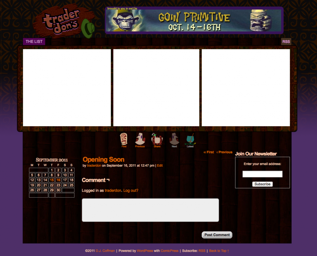
Here’s the basic layout I came up with… you can see the full size version at traderdons.com

By no means is this the FINAL thing… I have a lot I’d like to add, but I want the initial focus to be on the comic itself when you enter the site. Of course there’s room up there for an official sponsor, etc, but I don’t want the site weighed down with ads or distractions from the “escape.”— I really like earthy tones mixed with purples and oranges.
 I’m pretty happy with my little archive hover buttons. They were a little tricky to make, but I think will add more of a tiki vibe to the site. Since the comic will be aimed at tiki fans, they’ll totally get that the “share” button is one of the multi drink tiki bowls. When you hover over them, neato alternate versions appear. The hardest thing about putting tikis into a navigation bar is, the nav is already so small, you have to really simplify tikis down to their essence with as few lines as possible.
 Another quick little fun note about the navigation bar…. the “First” is a Marquesian style tiki, who were said to have been the “first” tiki carvers.
And of course the “latest” button would suggest that modern tiki is all about the drinks, culture and cool tiki bar spots out there. When you’re surfing the archives the “latest” button will be a nice frosty colorful cocktail waiting for you. And when there’s no “latest” the glass is empty. If you hover the live button on the site it looks like the drink is stirring. Go try it out.
Are you on the List?
I want to utilize mailing lists in a different way. I don’t want to just e-mail you when there’s something for sale. I’d like it to be more like a cool conversation or some bonus incentive for being on a special list– maybe share bonus comics? Fun drink recipes? I’m not sure exactly what yet, but I’d LOVE to hear your ideas. What would make you want to join a newsletter list? Maybe I shouldn’t even call it a “newsletter”, “mailing list” or “list” at all. Maybe it’s like a high rollers club? The back room? This sounds like a lot of fun… even if only 5 people sign up!
 Anyways, for my mailing list purposes I really enjoy using Mailchimp and all the cool tools they have. (PS: if you signup under my link there, we both get 30 bucks in MonkeyRewards in our account!) Sometimes it feels like a bit TOO much when I just want to shoot a cool message or bonus comic or incentive to fans, but they really are superior with mailing lists…. which is why I won’t be using them.
 What?! Well, I found out via Mailchimp’s newsletter that they recently bought TinyLetter.com service and it seems like JUST the simpler thing I was looking for. Sure, you gotta host your own images yourself, but it’s simple and free. Another rad thing is, you can actually hit REPLY to the email you get and starts a conversation. Plus, since it’s a newer service I could pick my own little url username so I scooped up “comics” so the url for my mailing list is http://tinyletter.com/comics — You can sign up with it right now, right here.
The Logo…
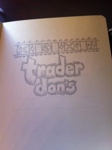
 The last thing I’ll talk about is the logo creation…. As you’ve already seen on this page and the TraderDons.com website, the lettering is similar to the original sketch from my sketchbook. I knew I wanted it kind of look like it was carved into a broken piece of wood or driftwood.

I hung the hat on there as a last minute edition and I liked the way it looked, so it stuck to the final design for the header. It also ties into the underlying story in the strips…
That’s it for now! Stay tuned for more… I have some cool character designs and I’ve been working on writing the first couple weeks worth of strips. Fun fun fun!

I dig the hell out of the tiki navigation buttons.